The WorkKeys Graphic Literacy test is one of 8 sections of the ACT® WorkKeys test that assess work-related “hard” and “soft” skills and competencies. This section measures your ability to analyze data displayed as graphical materials.
Passing the graphic literacy section of the test is necessary for receiving the National Career Readiness Certificate (NCRC).
Scoring high on the WorkKeys test will demand exceptional data analysis capabilities, best achieved with proper practice and guidance. Make sure to check our:
On this page, you will find all you need to ace the ACT WorkKeys graphic literacy test, with practice questions, detailed solutions, and preparation tips.
What Is the WorkKeys Graphic Literacy Test?
The ACT WorkKeys graphic literacy test assesses the ability to comprehend, incorporate, and apply information presented in graphical material used in the workplace. The questions are set in real-life work-related situations.
The test has 5 difficulty levels, ranging from 3 to 7. The levels build on one another, each combining the competencies assessed in previous levels with new skills and challenges. For example, in level 5, you will need the skills from levels 3 and 4.
You will have 55 minutes to answer 38 questions.
This section of the WorkKeys test can be administered by computer or pencil-and-paper, depending on the testing center you registered at.
If you're looking for free practice, you can check our Free Workkeys Practice Test.

WorkKeys Graphic Literacy Test – Level 3 Questions
In level 3 of the WorkKeys graphic literacy test, you will be presented with simple and low-moderate complexity graphs with one or two axes, several levels of data, several variables, and up to 20 data fields. You will need to demonstrate skills such as locating, finding, and identifying information.
- Locating, finding, and identifying information
- Determining the next step in the graph
Let's see how it looks –
WorkKeys Graphic Literacy Test Level 3
Practice Question #1
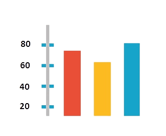
The following chart shows the average temperature, in °F, for Monday (orange), Tuesday (yellow), and Wednesday (blue). What was the approximate temperature on Tuesday?
WorkKeys Graphic Literacy Test Level 3
Practice Question #2
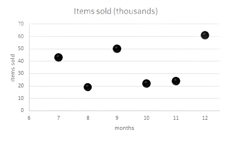
The graph below charts the number of items sold each month. Approximately, how many items were sold in month 12?
WorkKeys Graphic Literacy Test – Level 4 Questions
In addition to the type of questions you answered in level 3, you will be presented with high-moderate complexity graphs with several levels of data, many variables, and a moderate number of data fields. You will need to demonstrate skills such as comparing various pieces of data and identifying trends.
- Locating information in a graph by using the information found in another graph
- Comparing two or more pieces of data
- Identifying trends, patterns, and relationships
- Making inferences and decisions
- Identifying the graphs that represent the data accurately
Let's check it out –
WorkKeys Graphic Literacy Test Level 4
Practice Question #1
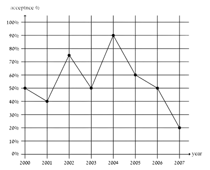
As a university program coordinator, you must track and analyze student acceptance rates over the course of several years. According to the chart below, which of the statements below is correct?
WorkKeys Graphic Literacy Test Level 4
Practice Question #2
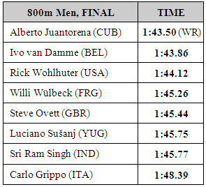
You are a promotions junior manager at a big broadcasting company. Which channel did most people watch between 16:00–18:00? (The table below presents rating per channel with rating measured by the percentage of viewers nationwide.)
WorkKeys Graphic Literacy Test – Level 5-7 Questions
In addition to the type of question you answered in levels 3 and 4, you will be presented with difficult complexity graphs that have more than two axes and densely presented data fields. You will need to demonstrate skills such as comparing several trends and justifying the effectiveness of one graph over another.
Although the skills you are required to demonstrate in levels 5, 6, and 7 stay the same, the complexity of the graphs increases, and they become more elaborate and complicated.
- Comparing two or more trends, patterns, and relationships
- Interpreting trends, patterns, and relationships
- Making inferences and decisions based on one graph after finding information in another graph
- Justifying inferences and decisions based on information
- Identifying the effectiveness of one graph over another
- Justifying the efficacy of one graph over another
Let's view practice questions –
WorkKeys Graphic Literacy Test Level 5
Practice Question #1
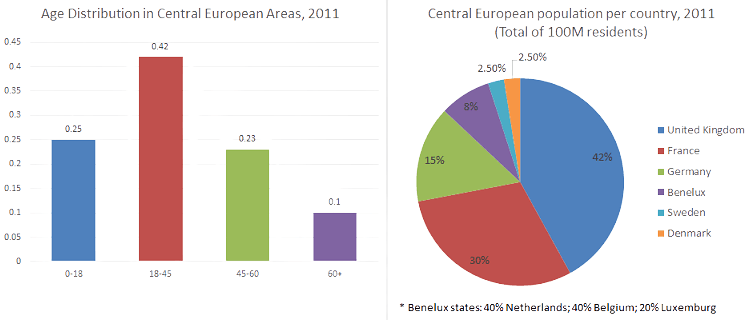
You are working for the UN Economic Commission for Europe. Your current task is to analyze the demographics of Central European countries. What percent of Central Europe's total population is Sweden's population?
WorkKeys Graphic Literacy Test Level 5
Practice Question #2
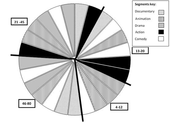
Below is a pie chart depicting the viewing habits of different age groups in relation to different genres in a specific movie theatre. Each segment of the pie represents about 4% of all movies viewed in an average year. Each segment represents a genre according to the segments key. Each chart is divided into four parts so that each part describes a different age range. These age ranges are represented by different rectangles at the side of the chart.
For example: 75% of the movies viewed by 4–12 year olds are animated films.
Which age group watches more movies than any other?
WorkKeys Graphic Literacy Test Level 6
Practice Question #1
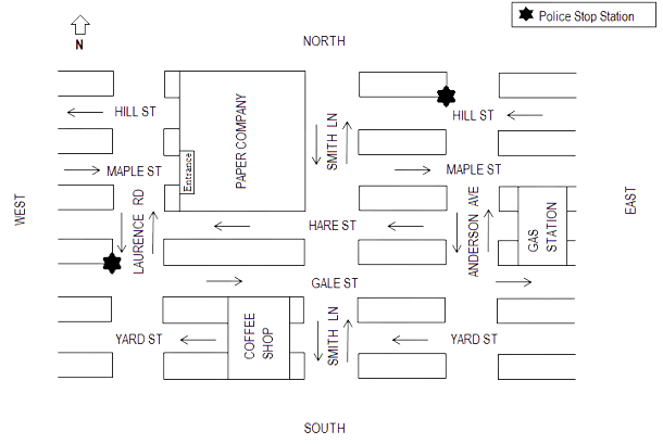
You are a police officer in Ciny Town. You have just turned right from Maple St. on your way to the Police Stop Station on Laurence Rd. when you are called to attend an emergency meeting near the other police stop. Which way would you take to arrive at your destination as quickly as possible?
An arrow on a street indicates that, unless otherwise specified, along the entire street traffic is only allowed to travel in the direction in which the arrow is pointing.
Note: Police officers do not have to adhere to traffic regulations during emergencies.
WorkKeys Graphic Literacy Test Level 6
Practice Question #2
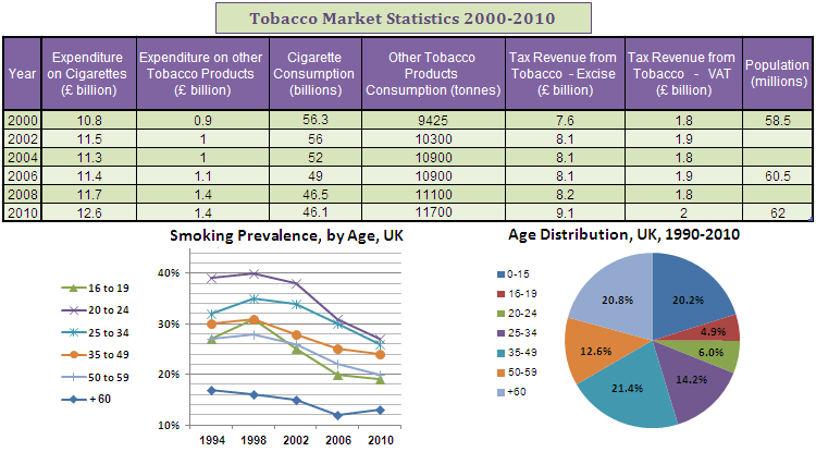
You work as a data analyst for a public health services organization. Your task is to find correlations between major global events of a certain year and the rate of smoking in each country.
What was the smoking prevalence in the UK in the fourth biggest age group in 2002?
WorkKeys Graphic Literacy Test Level 7
Practice Question #1
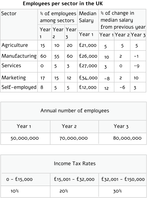
In year 3, what was the approximate ratio of the median salary of the agriculture sector to the median salary of the self-employed sector?
WorkKeys Graphic Literacy Test Level 7
Practice Question #2
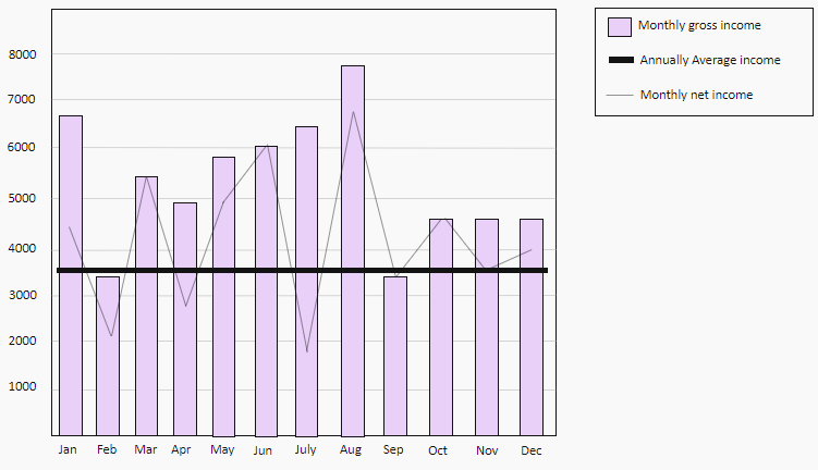
Which month reflects an increase in the monthly gross income from the prior month, with the largest drop in the monthly net income?
Think you got it? Check out our full WorkKeys practice test
----
JobTestPrep's WorkKeys assessment PrepPack guides you through practice tests of the WorkKeys Graphic Literacy test, honing the specific skills needed for the various difficulty levels of the test.
Learn more about JobTestPrep's WorkKeys assessment test PrePack
WorkKeys Graphic Literacy Test Solving and Preparation Tips

Answer every question
The WorkKeys Graphic Literacy Test score is calculated based on the number of correct answers, and there is no penalty for an incorrect answer. Thus, if you can't figure it out, it is better for you to guess than leave it unanswered.

Eliminate unnecessary data
The questions contain a lot of information, not all relevant to the answer. Sorting out the relevant data can be pretty challenging under a strict time limit; thus, you need tricks to help you quickly locate the required information. You can find these techniques in our WorkKeys assessment test PrePack

Pay attention to every detail
Now that you know what information you are searching for, you need to focus on the fine details. Your answer can be found in every piece of data given, especially in the high-level questions, where you need to compare several graphs.

Prepare for the proper WorkKeys type of questions
The WorkKeys Graphic Literacy test assesses specific skills needed daily in many positions. This is why it's essential for you to prepare for these particular types of questions and not waste your time on generic numerical practice tests.
JobTestPrep's PrepPack is specifically tailored for the WorkKeys assessment test, providing you with all the tools to ace the test and receive your National Career Readiness Certificate (NCRC).
Or read more about our ACT WorkKeys Preparation Pack


